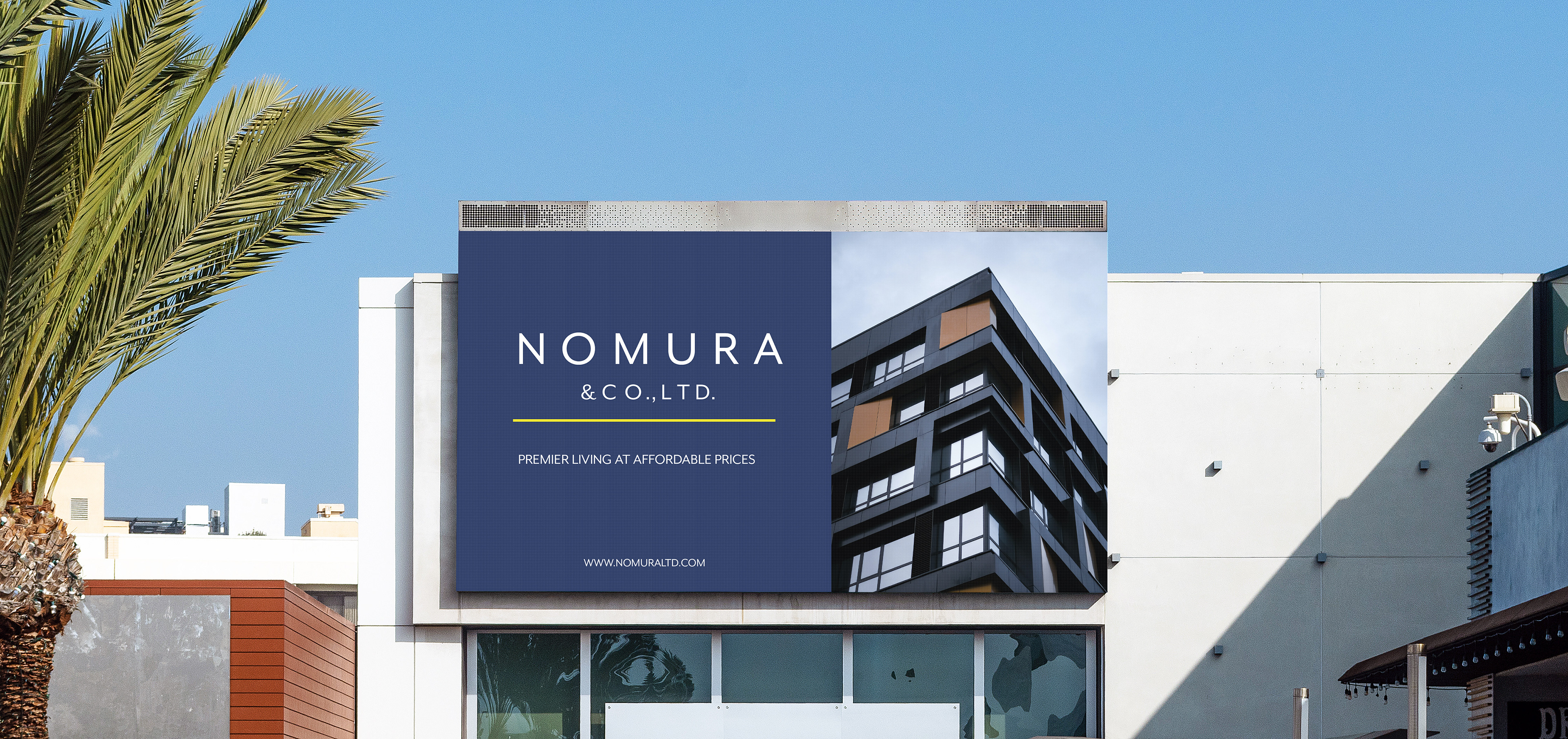
Nomura & Co.
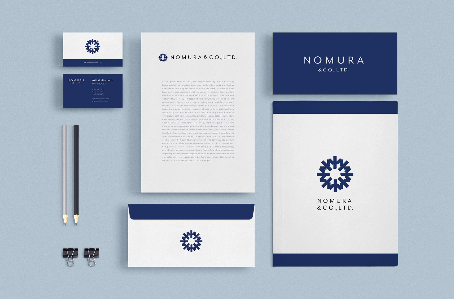
Nomura & Co. is a real estate brokerage specializing in middle-class residential areas. This is a conceptual client that I wanted to embody a commitment to excellence, heritage, and distinction.
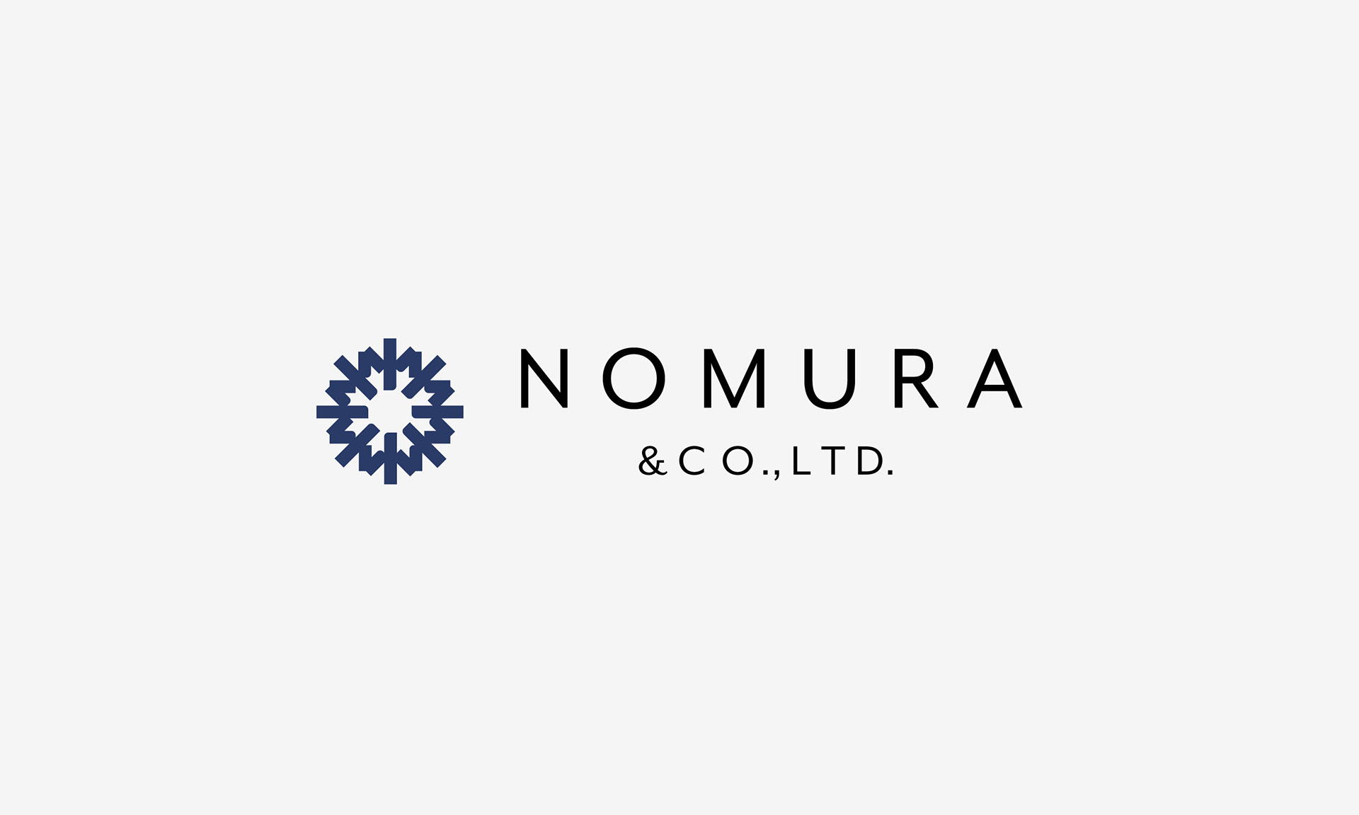
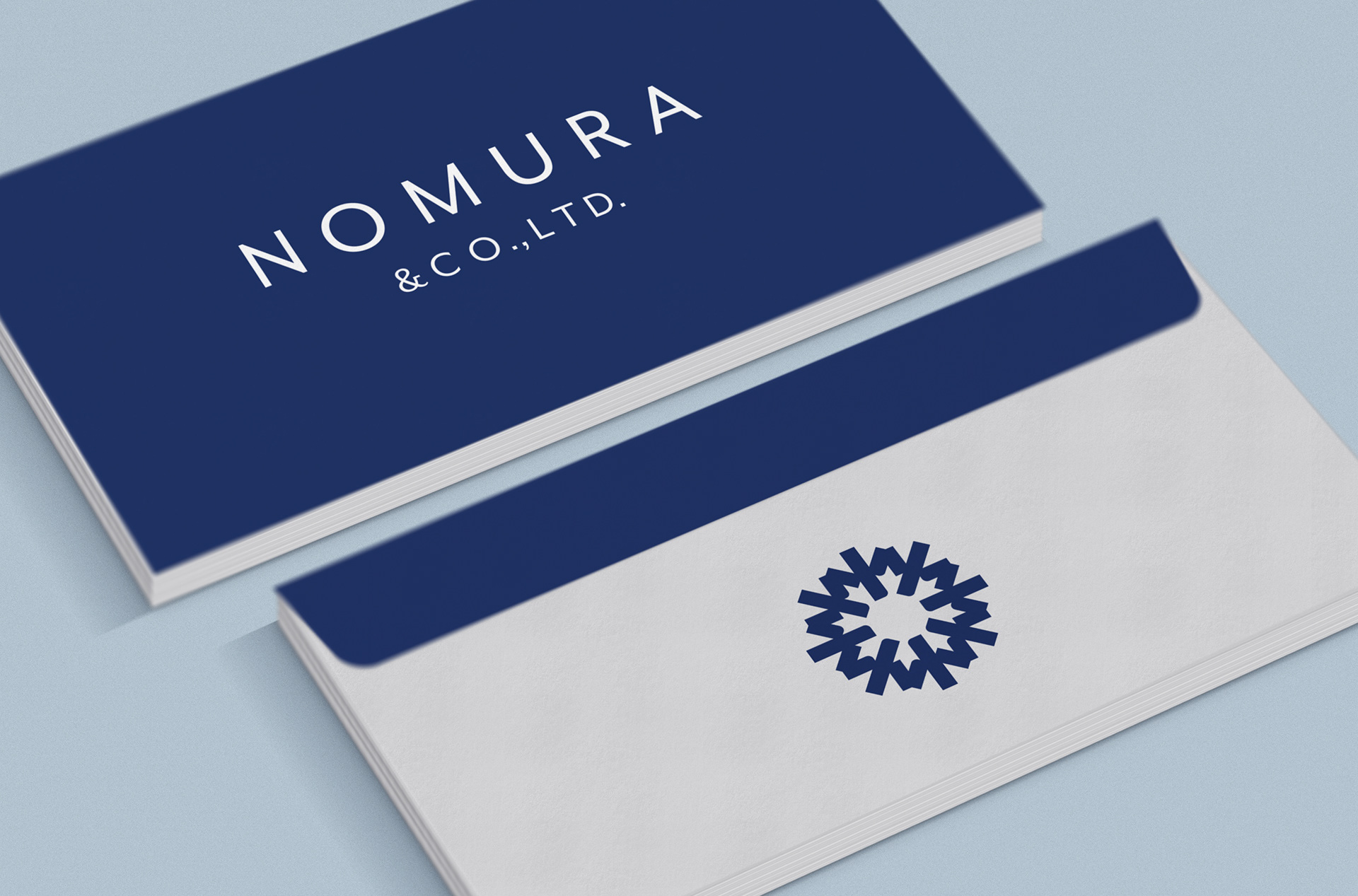
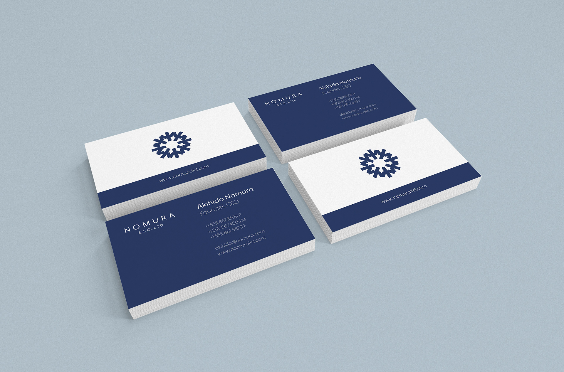
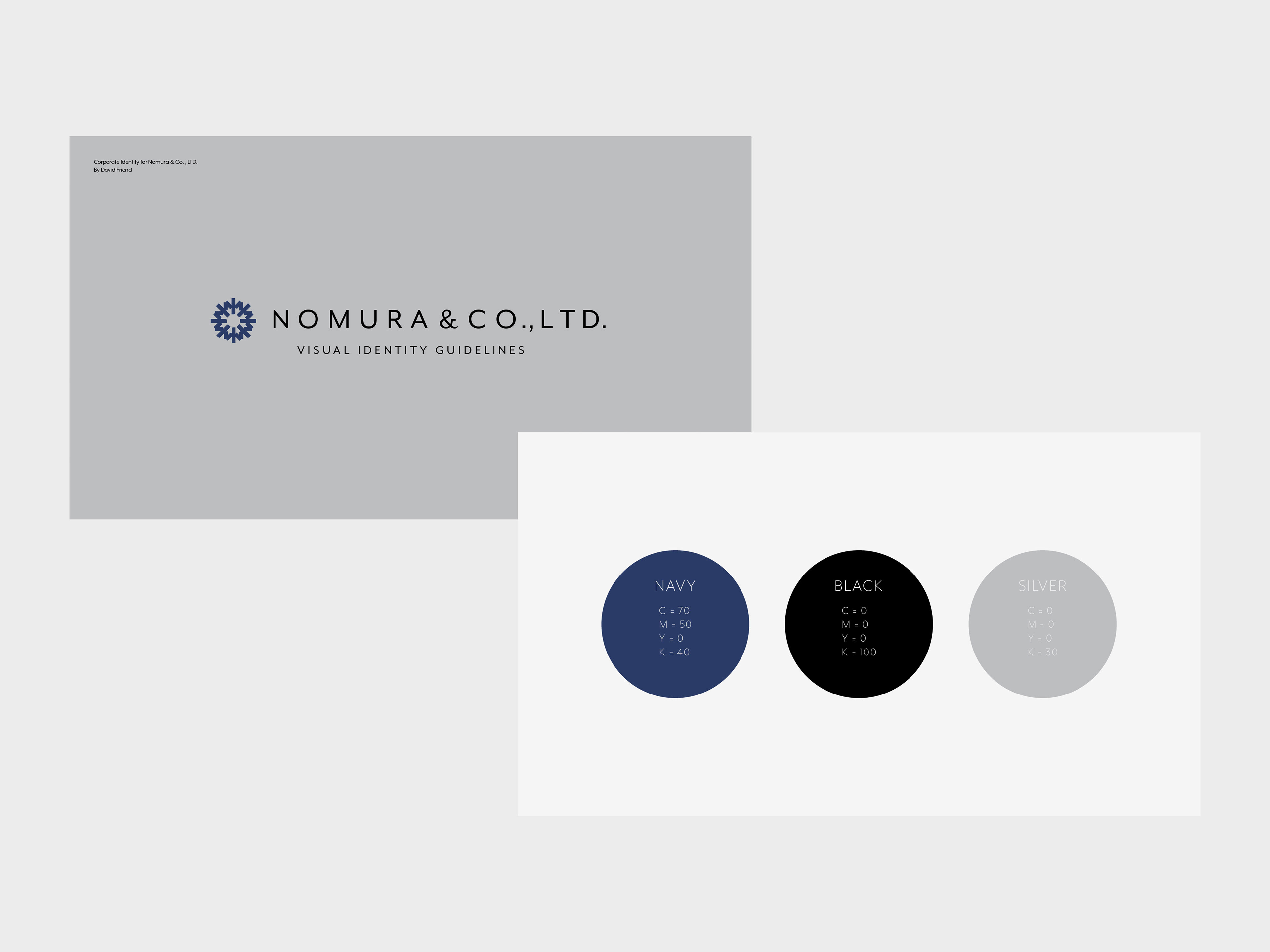
What resulted is a cohesive brand identity system, featuring a meticulously crafted logo. The logo, inspired by the company name, meaning “plain” or “field” in Japanese, elegantly integrated a snowflake and sun, symbolizing simplicity, elegance, and a symbolic connection to Japan’s national heritage.
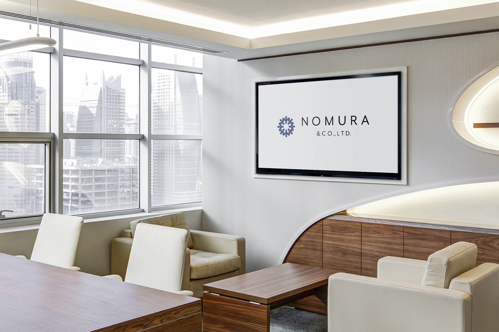
The applications were kept simple and pure to champion the elegance and sharpness of the company's ethos. As is always the case, simple and honest communication was the best way to move forward with this company.


Ready to talk?